CSS Layouts
There are many ways of using CSS to create a layout comprised of many different sections of a website. Originally, HTML was used exclusively for both structure and design, but as HTML evolved came a reevaluation of semantic markup, and a discouragement of overexcessive usage <div> tags and unnecessary <br> tags, in favour of moving layout and aesthetics towards CSS in a push towards responsive design and inclusive HTML markup for ease of use with screen readers and search engines.
Previous Methods
Previously, layout was done using anchors such as floats, clears, and 'top', 'left' etc. properties. These still have their uses, but a website under construction right now should steer clear of designing their layout using purely these properties. These properties are great as long as your website is static, and every visitor uses the same monitor, font size, and browser. The problems arise with when the site is accessed using a resolution of significant difference, or font size is altered. Properties such as float also have their issues which can be frustrating to fix, and cause problems to the whole site if every item is relative to another. One example is a <div> collapse, which can arise because of several reasons. One of the most common is when every child element in a container is floated - The parent container collapses on itself and is no longer visible. This can be solved using the width: 100%; and clear: both; declarations, but this is a clunky and unintuitive way to build a website, and adds a lot of excess code to a CSS stylesheet.
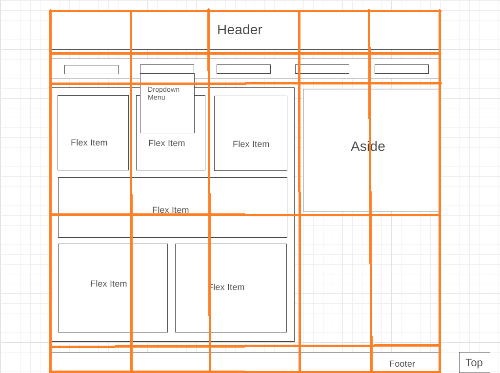
Flexbox
According to Coyier (2021), he flexbox is a suitable choice when creating layouts on a small scale (such as a specific container). It is dynamic, and changes based on the size of the container, which can also lead to a more responsive site. Flexboxes can be set using the display: flex; declaration, and can be further customised with the 'flex-wrap' property, 'justify-content', 'gap', and 'align-content/items'. Child items can also be reordered without editing the HTML code, and how much flexibility a specific item has can be stated using the 'flex-grow/shrink/basis' properties. There are, however, limitations, and examples of these are an inability to resize and rotate items, and this is often achieved using javascript.