Responsive Design
Media Types
When considering a responsive website it is important to take advantage of media types. The three main media types we use nowadays are screen, print, and speech. Screens range from smart watches, mobile phones, tablets, desktop screens, and 50+ inch TVs. Print refers to printed media such as books and magazines, but is increasingly being incorporated in dynamic and responsive devices such as e-book readers. Speech refers to screen readers and devices aimed at helping those with physical or visual impairments access the website.
Read more about Media TypesMedia Queries
Media queries are a great solution to a world saturated with an almost infinite number of devices with their own screen dimensions and resolutions. The rise of smart phones and other devices able to access the world wide web has made it a necessity to design websies to respond to different media and screens, and even the most competant web developer would find it a challenge to create bespoke sites for every single device.
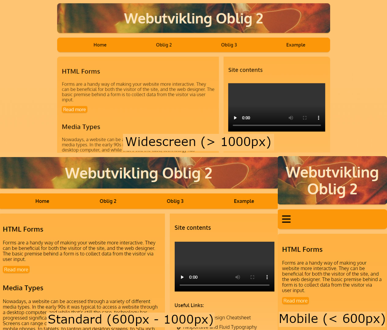
How exactly does a developer account for such a diverse array of resolutions? Breakpoints. With media queries, we can specify a range of pixel resolutions. The syntax @media only screen and (max-width: 600px) {property: value;} can be used to create specific CSS declarations that only apply to screens with a maximum width of 600 pixels i.e. a mobile-friendly version of the web page. The query is flexible enough that several more breakpoints can be declared and, in the case of this site, they were min-width: 600px; and min-width: 1000px;. This means that this specific web page has three different breakpoints. A mobile-friendly layout, a layout for older 4:3 ratio monitors (or browsers that are downsized, or snapped to cover half of the screen), and widescreen monitors.
Flexible Sizing
Sites are increasingly being designed with the perspective that font size shouldn't be imposed on the visitor, and a responsive site should cater to those who wish to increase or decrease font sizes without breaking elements or layouts. Dynamic layouts covered previously such as flexbox and grid contribute massively to a responsive site, but the developer can also make use out of measurements such as ems and rems (root em), viewport height and widths (vh and vw), and fractions (fr). I have made use of a modular layout conceptualised by Chris Coyier in 2015, whereby the html element is given a default font size value (16px), and layout elements such as the navigation bar, main, and aside are then given values in root ems (relating to the default value stated earlier). Headers and inline typography elements are then given values in ems, which are based off their parent elements (stated in rems). What does this result in? It results in every single element on the site able to resize if the default html font size is changed from 16px.